The safest email newsletter dimensions are still simple: use a 600–640 px desktop layout, make it responsive on phones, size images to the content area, and keep CTA buttons large enough to tap. Go wider only if your builder supports it and you test the email before sending, because a few extra pixels are not worth broken spacing or sideways scrolling.
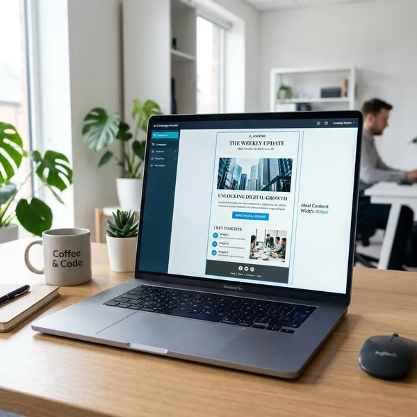
Best email newsletter width
| Width choice | Best fit | Practical note |
|---|---|---|
| 600 px | Safest default templates | Use this when compatibility matters more than extra design space. |
| 620–640 px | Modern newsletters with more padding or larger visuals | Good if your builder and tests show clean rendering. |
650–660 px for supported builders
A 650–660 px layout can work, but it should be treated as a tested design choice, not a new default. It makes the most sense for image-heavy campaigns, ecommerce promotions, or polished brand newsletters where the extra space improves the desktop layout.
Skip this range if you rarely test your emails. A small business sending quick updates from a basic drag-and-drop builder is usually better off staying near 600 px than chasing a wider look that may not hold up in Outlook or older inbox views.
Fluid width for smaller screens
Fluid width lets the email shrink to the available screen instead of forcing a desktop container onto a phone. The usual setup is a max-width around 600–640 px on desktop, with the content scaling down inside the mobile viewport.
- Check for sideways scrolling: if readers have to pan left and right, the layout is too rigid.
- Keep images flexible: they should scale down with the content area.
- Test the actual email: builder previews do not always catch inbox-specific quirks.
Single-column layouts for mobile
Single-column layouts are the cleanest choice for mobile because they match how people read email on a phone: top to bottom, one section at a time. Two-column desktop blocks can still be used, but they should stack in a logical order on smaller screens.
Email newsletter image sizes
Image dimensions should follow the layout, not the other way around. Start with the content width, decide where each image appears, then export files at a size that looks sharp without making the email slow.
Match images to the content width
Full-width images should match the displayed content width. In a 600 px email, a banner that spans the body should display at 600 px wide; a half-width or card image should be prepared for the smaller space it actually occupies.
For a quick check, preview the email and look at alignment: image edges should line up with the text column or the intended card boundary. If one image sticks out, looks stretched, or sits a few pixels off, the sizing needs cleanup before sending.
Use larger files for sharper displays
For sharper screens, create important images at about 2x their displayed width. A hero image displayed at 600 px can be exported around 1200 px wide, then displayed at 600 px in the email.
- Use 2x for key visuals: hero banners, product photos, logos, and text-based graphics.
- Avoid 2x everywhere: small decorative images rarely justify the extra weight.
- Compress after resizing: sharp does not need to mean heavy.
Keep image ratios consistent
Consistent ratios make repeatable sections look intentional. If you show three article cards, use the same thumbnail ratio for all three; if you show product tiles, keep those product images visually aligned.
Compress images before sending
Compression is one of the easiest ways to make a newsletter feel faster. Resize the image first, export it in a suitable format, then compress it before uploading.
- JPG: usually best for photos and lifestyle images.
- PNG: better for logos, icons, transparency, or crisp edges.
- GIF: use sparingly, because animated files can become very large.
- Final check: send a test to a phone and see whether the top image loads quickly.
CTA button dimensions
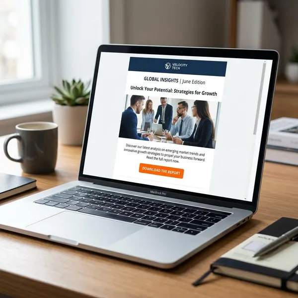
CTA buttons need to be designed for thumbs, not just for a neat desktop screenshot. A button should be large enough to tap, spaced far enough from other links, and obvious enough that a skimming reader knows what to do next.
The priority order is simple: tap area first, spacing second, visual style third. A beautiful button that is hard to press is still a weak button.
Use at least a 44 × 44 px target
Use at least a 44 × 44 px clickable target for important buttons. That size gives readers a realistic tap area on phones, especially when they are checking email quickly or using one hand.
The clickable area matters more than the text label itself. A short label such as "Read More" can still work if the button has enough padding around it; a long label in a tight box often feels clumsy.
Add enough space around buttons
Give buttons clear space above, below, and around nearby links. Crowded buttons are easy to miss and easy to tap incorrectly, especially when a text link or product image sits too close.
- Separate primary and secondary actions: do not stack them so tightly that they compete.
- Leave breathing room after body copy: the button should feel intentional, not squeezed in.
- Check on mobile: spacing that looks generous on desktop may feel tight on a phone.
Use wider buttons on mobile
Mobile buttons often work better when they span much of the content width while still leaving side padding. This makes the action easier to notice and easier to tap with a thumb.
For a one-off sale email, a wide primary button near the top can help ready-to-buy readers act quickly. For a longer editorial newsletter, use wider buttons at section breaks so readers can choose the story or resource they care about without hunting for small text links.
How long should a newsletter be?
There is no ideal newsletter height in pixels. A short promotion may only need one strong message and one CTA, while a long editorial digest can work well if it is clearly divided and easy to scan.
The better question is whether the email earns the scroll. Put the most important content early, remove repeated blocks, and watch the HTML size so Gmail does not hide part of the message behind a clipping link.
No fixed pixel height
Email height does not have a universal rule. Some campaigns are compact; others run long because they include multiple stories, offers, or updates. Length becomes a problem when the email feels repetitive, hard to navigate, or technically bloated.
Keep key content near the top
The first screen should make the value clear. Put the main headline, strongest offer, featured story, or primary CTA high enough that readers do not need to scroll through a large logo, decorative banner, or long introduction first.
Break long emails into sections
Long newsletters need visible sections so readers can skip, pause, and choose. Use headings, dividers, spacing, and repeated content patterns carefully so each block feels findable without becoming noisy.
- Digest newsletter: group stories by topic or priority.
- Product update: separate new features, fixes, and next steps.
- Event email: keep date, location, agenda, and registration action distinct.
Keep HTML below the clipping limit
Gmail commonly clips emails when the HTML code is around 102 KB or more. This is about code weight, not just visible length, so a visually moderate email can still clip if the template is full of repeated styles, copied formatting, or hidden blocks.
Before sending a long campaign, send a real test to Gmail and check whether the full footer, unsubscribe area, and tracking-sensitive content still appear without a "View entire message" link. If clipping happens, clean the template before cutting useful content at random.
Mobile newsletter dimensions
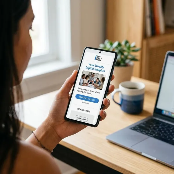
Mobile sizing is less about one exact pixel width and more about how the email behaves inside a narrow screen. The layout should resize smoothly, keep text away from the edges, and make every important action easy to tap.
If you have time to test only one thing, test the mobile version. A desktop design can look polished while the phone version is where most of the friction shows up.
Use responsive content width
Use a responsive content width that fills the available mobile screen without forcing horizontal scrolling. A desktop max-width around 600–640 px can still be used, but the mobile version should shrink naturally inside the viewport.
Keep layouts to one column
One column is the safest mobile structure because it gives every block the full available width. If your desktop email uses two product cards side by side, stack them on mobile and keep the order clear: image, short text, then button.
Scale images to the screen
Images should scale down with the content area and keep their original proportions. Do not let a wide banner overflow the screen or force the surrounding text out of alignment.
- Set a sensible max width: the image should not grow beyond its intended desktop size.
- Allow 100% mobile scaling: the image should fit the available content column.
- Check for distortion: never stretch height and width independently.
Leave comfortable side padding
Side padding keeps the email from feeling cramped. Around 16–30 px often works well on mobile, depending on the design and screen size.
Too little padding makes text feel glued to the edge. Too much padding narrows the reading column and can make short lines look choppy, so preview the email on an actual phone rather than relying only on the editor canvas.
Keep tap targets large
Important tap targets should be at least 44 × 44 px, including buttons, linked images, and key navigation items. Also leave enough space between clickable elements so a reader does not accidentally hit the wrong link.
Conclusion
A good newsletter layout does not need unusual dimensions; it needs safe defaults used consistently. Start with 600 px if you want the lowest risk, move toward 640 px only when the design benefits, and let mobile behavior, image weight, button size, and Gmail clipping checks guide the final decisions.