The easiest newsletter format to reuse is simple: a clear header, a short opening, a few organized content blocks, one main call to action, and a footer people can recognize. Start with the layout your readers will actually use, usually a mobile-friendly single column for email and a column-based page only when the newsletter is meant for print.
Which Newsletter Layout Should You Use?
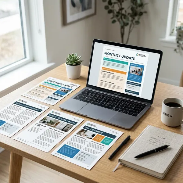
Choose the layout by reading situation first, not by what looks most designed. A parent checking a school email on a phone needs a different structure from a club member reading a printed monthly sheet on a noticeboard.
| Best fit | Use when | Watch out for |
|---|---|---|
| Single column | Most email newsletters, especially mobile readers | Long blocks can still feel heavy if the writing is dense |
| Modular | Several short updates, offers, or announcements | Too many equal blocks can hide the main message |
| Two column | Mostly desktop readers or internal updates | Mobile stacking order must be tested |
| Text-first | Personal notes, creator emails, consulting newsletters | Needs a strong opening, not a wall of text |
| Multi-column print | Printed school, club, church, or community newsletters | Crowding the page makes it harder to read |
How to Format a Newsletter for Mobile
Mobile formatting should remove friction. Readers should be able to identify the sender, understand the main point, and tap the main action without zooming, pinching, or searching through crowded sections.
Use one responsive column
A responsive single column is the safest mobile structure because it follows the way people naturally scroll. It also keeps the main call to action in a predictable place instead of forcing readers to compare side-by-side content on a small screen.
If you use a template with multiple columns, check the mobile preview carefully. The real question is not whether it looks neat on desktop, but whether the mobile version still reads in the right order.
Keep paragraphs short
On a phone, a normal desktop paragraph can feel like a block of work. Keep most paragraphs to one idea, and break long explanations before they start to look dense.
- For announcements: lead with the date, deadline, or change.
- For offers: state the benefit before the supporting detail.
- For personal notes: keep the opening warm but not rambling.
Use clear section headings
Headings should tell readers what they are about to get. "Upcoming Dates," "Member Updates," or "New Resources" is more useful than a vague heading like "Don't Miss This."
Make buttons easy to tap
The main button should be large enough to tap comfortably and separated from nearby links. Button text should also be specific: "Register for Friday's Event" is clearer than "Click Here."
If your newsletter has several possible actions, choose one primary button and make the rest secondary links. Too many equal buttons turn a simple decision into a menu.
Resize images automatically
Images should scale to the screen instead of forcing horizontal scrolling or pushing text out of place. Use visuals only when they help the reader understand the offer, event, product, or story faster.
For mobile readers on slower connections, oversized images can be a real problem. Compress large files before sending, then check that captions, buttons, and nearby text still sit in the right order.
Avoid wide tables and fixed layouts
Wide tables are one of the quickest ways to make a mobile newsletter hard to use. If you need to share dates, prices, or schedules, stacked content blocks are often easier to read than a desktop-style table.
A fixed layout may look tidy in the editor and still fail in an inbox. Send yourself a test and open it on an actual phone before trusting the design.
How to Build Your Newsletter Format
Build the format before you worry about decoration. The order should answer three questions quickly: what is this issue about, what matters most, and what should the reader do next?
Define one goal
One newsletter issue should have one main job. If a bakery is taking holiday pre-orders, the headline, opening, product image, and button should all point toward ordering; adding unrelated news at the top weakens the message.
For a monthly community update, the goal may be different: help people feel informed. In that case, a balanced modular structure makes more sense than one oversized sales-style feature.
Choose the section order
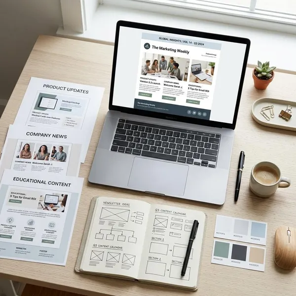
Put the most important item where attention is highest: near the top, after the header and short opening. A reliable order is header, opening, featured item, secondary blocks, and footer.
Move low-priority items down. Social links, minor reminders, and "nice to know" updates should not appear before the reason people opened the email.
Create a clear visual hierarchy
Visual hierarchy tells readers what to notice first. Use a stronger heading for the lead item, smaller headings for secondary blocks, and enough spacing so the page does not feel cramped.
- Primary: the main story, offer, update, or event.
- Secondary: supporting links, reminders, or related resources.
- Utility: footer details, contact information, preferences, and unsubscribe links.
Add one main call to action
A good call to action finishes the thought the newsletter has already started. After an event note, "Reserve Your Seat" is stronger than a generic "Learn More." After a fundraising story, "Support This Project" feels more connected than a vague donation button.
Keep secondary links visually quieter. Readers should not have to decide between five equally loud next steps.
Test the email on different screens
Testing is where hidden layout problems show up. Open the email on a phone and a desktop, then check the subject line, preheader, image size, heading spacing, button placement, and link behavior.
If the newsletter will be printed, test the printed page too. Margins, photo contrast, and line breaks can look very different on paper than they do on screen.
Save it as a reusable template
Once the format works, save it. A stable template makes future issues faster to produce and helps regular readers know where to find the main story, updates, links, and footer.
You can still change the feature, images, colors for a campaign, or number of blocks. The point is to keep the structure familiar while leaving enough flexibility for different issues.
Newsletter Formats by Use Case
The same structure will not suit every sender. A marketing offer needs speed and clarity, while a nonprofit story needs enough room for the reader to care before being asked to act.
Offer-led formats for marketing
An offer-led newsletter should get to the point quickly: what the offer is, why it is worth attention, and how to claim it. Place the offer near the top with a clear headline, a strong product or service image if useful, short copy, and one main button.
This format suits short campaigns, seasonal sales, launches, and limited-time service promotions. Avoid long introductions that delay the value.
Update-led formats for companies
Company newsletters usually work best as organized updates rather than one long announcement. Group items by type, such as product, people, events, or policy changes, so readers can scan based on their role or interest.
- For employees: put urgent internal changes before culture stories.
- For customers: lead with product changes, service updates, or deadlines.
- For partners: make dates, requirements, and next steps easy to find.
Link-led formats for creators
A creator newsletter can be built around curated links, but the links need context. A short note explaining why each link is worth opening often matters more than the number of links included.
Keep this format light if you send often. A short personal opening, three to five strong links, and one closing prompt can feel more useful than a long roundup readers never finish.
Event-led formats for schools
Event-led newsletters should make dates, times, locations, deadlines, and required actions hard to miss. Put the nearest or most important event first, then add smaller reminders underneath.
For a school email read by parents on a phone, use a single column with bold dates and short notes. For a printed school newsletter sent home in backpacks, a tidy multi-column page may work better, as long as the key dates are not buried.
Story-led formats for nonprofits
A nonprofit newsletter often works best when it starts with a specific story or impact moment before asking for support. The story gives the action a reason, whether the next step is donating, volunteering, attending, or sharing.
Use numbers carefully. A statistic can strengthen the story, but it should not replace the human reason people care.
Conclusion
A good newsletter format is not the most elaborate one; it is the one readers can understand quickly and you can reuse without fighting the layout every time. For most email newsletters, start with a single responsive column, one clear goal, and one main action. Move to modular, two-column, text-first, or print columns only when the reader's situation genuinely calls for it.