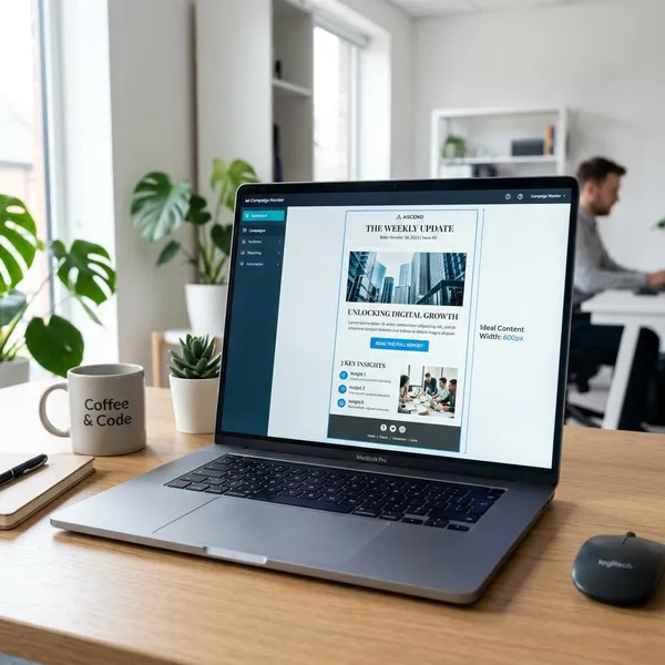
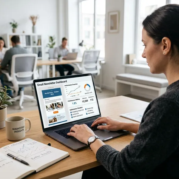
The best newsletter design is the one that makes the email easy to understand in the first few seconds. Start by choosing the layout that matches the job of the newsletter, then make the main message, reading flow, and next action obvious on mobile. Decoration helps only when it supports that clarity.
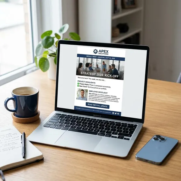
Best newsletter layout styles
Newsletter layout should follow intent. A weekly creator note, a media digest, a product launch, and a community update all need different visual priorities because readers use them differently.
| Newsletter type | Best fit | What to avoid |
|---|---|---|
| Creator or expert email | Text-first layout with a clear point of view | Too many banners or design elements that make it feel less personal |
| Media or publisher email | Editorial layout with a lead story and grouped sections | Equal-weight story blocks that make everything look equally important |
| Ecommerce campaign | Product-led layout with strong images and direct buying paths | Showing too many products without a clear main offer |
| Curated digest | Roundup layout with short context for each link | A plain list of links with no reason to click |
| Community or membership update | Update-led layout with labeled actions and dates | Burying deadlines, RSVPs, or sign-ups in long paragraphs |
What should every newsletter include?
Almost every newsletter needs the same basic foundation: readers should recognize the sender, understand the main point, scan the content, find the main action, and trust the footer. The style can be minimal or polished, but those jobs should be covered.
A recognizable header
The header should confirm who the email is from before the reader has to think. A logo, newsletter name, issue date, small brand mark, or consistent color cue is usually enough.
Keep it lean. Navigation links, multiple announcements, and oversized branding can push the real content too far down, especially on a phone.
A strong lead section
The lead section should answer one quiet reader question: "Why should I keep reading this one?" That might be a useful insight, a featured story, a new product, a deadline, or a short personal note.
If the first screen only says hello, shows a large image, or delays the point, the design is making the reader work too hard. A strong lead gives the email direction before the scroll begins.
Scannable content blocks
Scannable blocks turn a newsletter from a long email into something readers can use. Short sections, clear labels, white space, and specific link text help people decide what deserves attention.
- One idea per block keeps the email from feeling dense.
- Short headings help readers scan without slowing down.
- Selective bold text can highlight a takeaway, but too much bolding creates noise.
- Clear spacing matters more than extra decorative dividers.
A clear primary CTA
Every issue should have one action that matters most. Even if you include several links, the reader should know whether you mainly want them to read, shop, register, reply, book, or share.
Match the CTA to the reader's stage. A warm audience may respond to "Reserve your seat," while a colder audience may need "See the agenda" before they are ready to sign up.
A useful footer
The footer is not just the place where legal links go. It should give readers control and reassurance: unsubscribe or preference links, contact details, support links, and any small brand note that makes the email feel legitimate.
A simple footer is usually better than a crowded one. If the reader reaches the end, do not distract them with five new directions unless those links genuinely help.

How to improve newsletter design
Improving newsletter design usually starts with removing confusion, not adding new visuals. The first checks should be goal, layout, flow, clutter, mobile reading, and testing.
Define the main goal
Before designing the email, decide what one outcome matters most. If the goal is product sales, the layout should not behave like a magazine digest. If the goal is replies, the email should feel more conversational and less like a landing page.
Choose one layout
Pick one primary layout for each send. Mixing a personal essay, product grid, event calendar, and link roundup in the same email can work occasionally, but it often makes the reader wonder what kind of message they are reading.
For a monthly brand newsletter, a mixed format may be acceptable because readers expect several updates. For a weekly newsletter, a stable format usually builds a stronger habit.
Simplify the content flow
Good flow gives the reader a natural path: main point first, supporting details next, action when interest is highest. If the email jumps between unrelated topics, group content by priority or theme before touching colors or fonts.
- Put the main message near the top.
- Place supporting sections in a logical order.
- Cut blocks that do not support the goal.
- End with a clear next step, not a pile of leftover links.
Remove visual clutter
Clutter is anything that competes with the message without helping the reader decide. Common offenders include too many buttons, repeated banners, crowded columns, heavy borders, and decorative images that push useful content down.
Optimize for mobile
Design for the phone view early, not as a final check. Short paragraphs, readable type, enough padding around links, and images that resize cleanly make a bigger difference than small desktop refinements.
This matters differently by audience. A B2B report newsletter may get more desktop reading during work hours, but a creator note, ecommerce sale, or community reminder is often opened in short mobile moments. If it cannot be skimmed with one hand, it needs work.
Test before sending
Testing should catch the problems that design previews miss. Send a test email, open it on desktop and phone, and check the real experience rather than only the template view.
- First screen: sender, topic, and main action should be obvious.
- Links: every major CTA should go to the right destination.
- Mobile spacing: buttons and links should be easy to tap.
- Dark mode: text, logos, and buttons should still be readable.
- Fast skim: headings should make the structure clear without reading every word.
Newsletter design checklist
Use a checklist to catch the small issues that weaken an otherwise good email. The most important checks are not cosmetic; they are about whether the reader can understand, scan, and act without friction.
Clear content hierarchy
The most important message should look and feel like the most important message. Size, placement, spacing, and contrast should guide the reader from the lead item to the supporting content and then to the CTA.
Check the email without reading every sentence. If you cannot identify the main point at a glance, the hierarchy is too weak.
Easy mobile reading
Mobile reading should feel comfortable, not squeezed. Use short paragraphs, visible section breaks, tappable links, and images that do not force the main content too far down.
Focused CTA placement
The main CTA should appear when the reader has enough context to act, not before the value is clear and not so late that many people miss it. For most newsletters, that means one visible CTA near the main section and only supporting links after that.
- Too early: the CTA feels pushy or unexplained.
- Too late: readers may never reach it.
- Too many CTAs: the email loses a clear priority.
Consistent brand style
Consistent style helps readers recognize your emails faster. Use familiar colors, typography, spacing, logo treatment, and tone, but do not make every issue look frozen in place.
Small variation is healthy. A product launch may need stronger visuals, while a founder note may need a quieter layout. The brand should feel consistent even when the emphasis changes.
Clean spacing and contrast
Spacing and contrast decide whether the newsletter feels calm or tiring. Give sections enough room, keep text readable against the background, and make links or buttons stand out without turning the whole email into a set of competing highlights.
Before sending, look for the simplest fix first: more space around a key section, fewer accent colors, clearer button contrast, or a shorter block of text. Those small edits often improve the reading experience more than a full redesign.
Conclusion
A strong newsletter does not need to look busy to feel designed. Choose the format that fits the reader's reason for opening, make the first screen useful, keep one action in focus, and test the mobile version before you send. If a design choice makes the email easier to read or act on, keep it; if it only fills space, cut it.