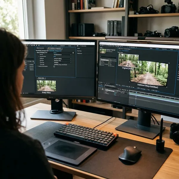
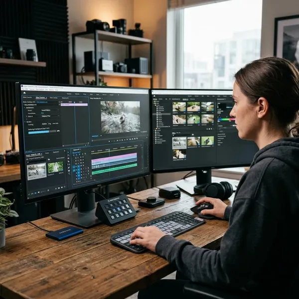
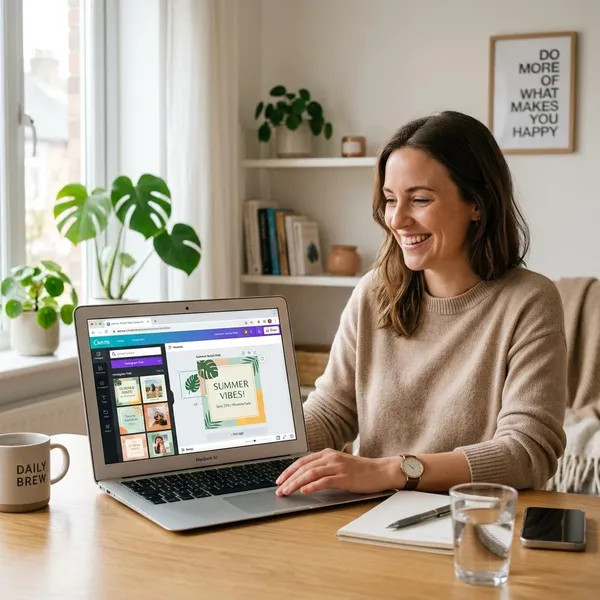
A good dual monitor setup for graphic designers should do one thing first: keep your actual design work on the most accurate screen while everything else stays close but out of the way. Start with a strong primary monitor, add a practical second screen for tools or references, then adjust the layout so you are not twisting your neck or second-guessing color all day.
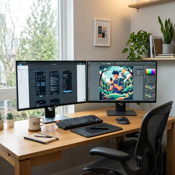
Best dual monitor setup for graphic designers
The best setup is usually not two identical premium displays. For most designers, the smarter choice is one color-accurate primary monitor for the canvas and one good-enough secondary monitor for support tasks.
| Designer situation | Practical setup choice |
|---|---|
| Daily design work with client delivery | 27-inch or 32-inch 4K IPS primary monitor, plus a 24-inch or 27-inch secondary screen |
| Small desk or home office | 27-inch primary monitor with a smaller secondary screen, possibly in portrait mode |
| Temporary or budget setup | Best available external monitor as primary, laptop or older monitor for notes and references |
| Photo, print, or brand-color work | Prioritize calibration and color accuracy on the primary display before upgrading the second |
Color-accurate primary monitor
Your primary monitor is where final visual decisions should happen. Put your canvas, artwork, preview, or active document there, especially when judging color, contrast, typography, spacing, and image detail.
At minimum, look for strong sRGB coverage and an IPS panel from a reliable model line. If you work with print, photography, or brand systems, Adobe RGB, DCI-P3 coverage, factory calibration, and hardware calibration support become more important. A cheap second monitor is acceptable; a weak primary monitor is where the setup starts to fail.
Secondary monitor for tools and references
The second screen does not need to be as color-accurate as the first, but it should be clear and comfortable enough that you actually want to use it. A 24-inch or 27-inch display works well for layers, swatches, browser tabs, file folders, notes, email, Slack, client comments, or a mood board.
Side-by-side or portrait layout
Side-by-side landscape monitors are the easiest layout for most designers because the screens feel predictable and software windows move naturally between them. It works especially well for Figma, Adobe apps, browser previews, and general multitasking.
- Use landscape if the second screen holds panels, previews, browser tabs, or mixed windows.
- Use portrait if you often read long briefs, review web pages, manage asset lists, or keep tall reference boards open.
- Avoid forcing portrait if it makes your neck tilt upward or turns the second display into a rarely used screen.
A setup that fits your desk and workflow
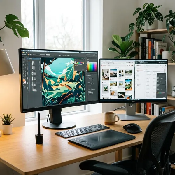
Before buying larger monitors, check your desk depth, keyboard position, tablet space, speakers, dock, and cable path. Two big displays on a shallow desk can look impressive and still feel uncomfortable after an hour.
Choosing your primary design monitor
Your primary monitor deserves most of the budget because it affects the work you actually deliver. Size, resolution, panel quality, and calibration support matter more than flashy gaming specs or a matching pair of screens.
27-inch vs 32-inch
A 27-inch monitor is the safest choice for many graphic designers. It gives enough room for detailed work without demanding a huge desk, and it is easier to center in front of you.
4K vs 1440p
Choose 4K for the primary monitor if your budget allows it, especially at 27 or 32 inches. Fine type, icons, image edges, and UI details look cleaner, which helps when you spend long sessions checking alignment or retouching small areas.
1440p is still usable, particularly on a 27-inch secondary screen or for designers who do not work heavily with fine detail. The mistake is buying a large low-resolution screen and expecting it to feel sharper just because it is physically bigger.
IPS panels and color accuracy
IPS panels are usually the practical choice for design because they tend to keep color and brightness more stable when viewed from different angles. That matters on a larger screen and even more when two monitors sit side by side.
Do not judge color quality only from marketing words like "vivid" or "professional." Look for published color coverage, calibration information, and reviews that include measured accuracy. A display made mainly for fast gaming may be great for motion but less trustworthy for color work.
Calibration support
Calibration support is worth caring about if your work needs repeatable color. Even a good monitor can drift over time, and two displays almost never match perfectly out of the box.
How to arrange two monitors for design
A dual-monitor workspace works best when each screen has a job. The primary monitor should be the decision screen; the second should remove clutter, not create another place to lose windows.
Set the primary display as the default in your operating system, open your main design app there, and then build the second screen around the tasks you check often during a project.
Keep your canvas on the primary screen
Put the active canvas on the primary monitor and keep it there by default. This keeps your color-critical work on the better display and gives your eyes a predictable center point.
Move tools and panels to the second
Tools, layers, swatches, properties, history, libraries, and file browsers are good candidates for the second monitor. They need to be visible, but they should not sit on top of your artwork.
- Adobe users: move floating panels off the canvas and save the workspace.
- Figma users: keep the file centered while references, comments, or browser previews sit beside it.
- Tablet users: leave desk space for hand movement instead of pushing everything forward.
Keep references visible
Reference material is one of the strongest reasons to use a second screen. Mood boards, brand rules, client notes, product photos, sketches, competitor examples, and web pages are easier to compare when they stay visible.
Separate communication from design work
Keep email, Slack, Teams, task boards, and comments away from the main canvas when possible. You can still glance at them, but they should not interrupt the screen where you are making design decisions.
For freelancers or remote designers, this separation is especially useful during review rounds. Client feedback can stay open on the second monitor while the edited file remains centered and calm on the primary display.
How to match colors across both monitors
Two monitors rarely look identical, even when both are good. One may look cooler, brighter, warmer, or more saturated, and that difference can make you doubt your own edits.
Match brightness and color temperature
Start with the simple settings before blaming the monitors. Set both displays to similar brightness and a similar white point, then compare them in the lighting you normally work in.
Calibrate both displays
Hardware calibration is the most reliable way to improve color consistency. Calibrate the primary display first if you only have time for one, then tune the secondary screen to sit closer visually.
Use monitor color profiles
Assign the correct color profile to each monitor in your operating system. Color-managed design and photo apps can use those profiles to display files more predictably.
If you recalibrate a monitor, update the profile instead of leaving the system tied to old behavior. A wrong or outdated profile can make one app look different from another and send you chasing a problem that is not actually in the file.
Recheck color consistency regularly
Recheck both screens after major OS updates, driver changes, desk moves, or lighting changes. A quick comparison with the same neutral image on both monitors can reveal obvious shifts in whites, grays, shadows, and skin tones.
- Check neutrals first: gray should not look blue on one screen and beige on the other.
- Compare real images: skin tones and shadows reveal problems faster than colorful wallpapers.
- Trust one screen: use the calibrated primary monitor for final color decisions.
Set up dual monitors for comfort
Comfort decides whether the setup feels useful after the first week. A second monitor should reduce friction, not make you lean, squint, twist, or constantly refocus between uneven screens.
Make small adjustments before buying accessories. Height, distance, angle, and desk depth often fix more problems than a new monitor does.
Center the primary monitor
Place the primary monitor directly in front of your chair. That is where your eyes and neck should spend most of the day, especially if the canvas lives there.
If both screens are used almost equally, angle them inward slightly. Still, keep the more accurate monitor closest to the center so design work does not happen off to one side all day.
Align both screens
Align the visible screen areas, not just the outer bezels. Different monitor sizes and stands can make the frames look even while the actual image areas sit at awkward heights.
If one monitor is vertical, align the part you look at most with your normal eye line. The point is smooth movement between screens, not perfect symmetry.
Set a comfortable viewing distance
Most people do best with monitors roughly an arm's length away, then adjusted based on screen size, resolution, and eyesight. You should not need to lean forward to read menus or pull your head back to see the whole display.
A 32-inch screen usually needs more distance than a 27-inch screen. If your desk is shallow, scaling settings, a monitor arm, or a smaller primary display may help more than simply increasing brightness.
Use a monitor arm when useful
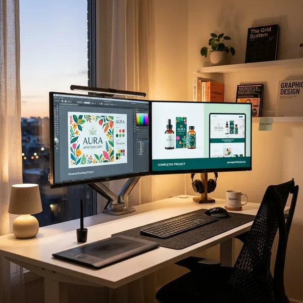
A monitor arm is useful when the stock stands are too low, too bulky, or too limited. It can also free up room for a drawing tablet, notebook, keyboard, or audio gear.
Conclusion
The strongest setup is usually simple: a trustworthy primary monitor, a second screen with a clear support role, and a desk layout that keeps your body relaxed while you work. Spend first on the display where you judge color and detail, then refine the second monitor around your real habits instead of chasing a perfectly matching pair.