If you want to learn graphic design from scratch, start with the basics that make a design clear before you worry about fancy effects or expensive software. The fastest path is usually simple: study good work, learn the core principles, practice in one tool, make small projects, and revise them after feedback. You can teach yourself, but you need a routine that forces you to look, make, compare, and improve.
What to learn first in graphic design
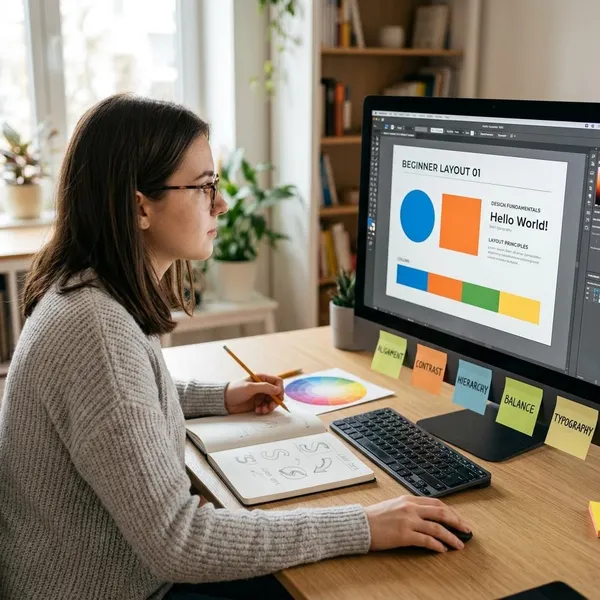
The first thing to learn is not Photoshop, Illustrator, Canva, or Figma. It is how visual decisions affect the way people read and understand information. A beginner who understands hierarchy, spacing, type, and color will make better work in any tool than someone who only knows where the buttons are.
Layout and composition
Layout is the way headlines, images, text, and empty space sit together. Before opening a design app, sketch two or three rough versions on paper: one with a large image, one with a strong headline, and one with more breathing room. This stops you from dragging elements around randomly and helps you decide what the viewer should notice first.
Visual hierarchy
Visual hierarchy tells the viewer what to look at first, second, and third. You create it with size, contrast, position, color, and spacing. On an event poster, for example, the event name, date, location, and call to action should not all fight for equal attention.
When reviewing your own work, blur your eyes or zoom out. If the most important information does not stand out immediately, increase contrast, adjust scale, or add more space around it.
Typography
Typography is often where beginner designs look weakest. Use one or two type families at first, not five. Build contrast with size, weight, spacing, and capitalization before adding more fonts.
- For body text: choose readability over personality.
- For headlines: choose a typeface that matches the tone.
- For spacing: give lines enough room so the text does not feel cramped.
Color theory
Color theory helps you choose colors that support the mood and keep text readable. Start with small palettes: one main color, one supporting color, and one neutral. That is easier to control than using six bright colors because they look exciting.
Spacing and alignment
Spacing and alignment make simple designs look polished. Keep related items close together, give unrelated items more room, and line up edges on purpose. If you are designing a menu, for example, the item names, prices, and descriptions should follow a consistent pattern so the reader does not have to work hard.
How to learn graphic design step by step
A good learning path keeps you from bouncing between random tutorials. The order matters: train your eye, learn the principles, choose one tool, copy for practice, make your own work, then revise. That loop is more useful than trying to "master design" in a vague way.
Study strong design examples
Save posters, packaging, landing pages, book covers, menus, and social posts that work well. Do not only collect pretty images; write one short note about why each example works. Is the headline strong? Is the color palette restrained? Is the spacing calm? These notes train your eye faster than passive scrolling.
Learn the core principles
Learn principles through tiny experiments. Make the same poster three times with different hierarchy. Set one paragraph in three type styles. Create a black-and-white layout before adding color. These exercises make abstract ideas practical because you can see how one decision changes the result.
For a beginner, depth beats variety. One week spent seriously practicing typography will usually teach more than watching ten unrelated tutorials without making anything.
Choose one design tool
Pick a tool based on what you want to make most often, then stay with it for at least a few weeks.
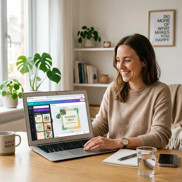
- Social posts, flyers, presentations: Canva is enough to start.
- Logos, branding, print layouts: Adobe Illustrator, Photoshop, or InDesign may be worth learning.
- Web and app screens: Figma is the most practical beginner choice.
- No budget: try Inkscape, GIMP, or Krita and focus on fundamentals.
Recreate existing designs
Recreating a design teaches precision. Choose a poster, ad, or simple landing page section and rebuild it as closely as you can. Match the margins, font sizes, image crop, line spacing, and alignment. Then place your version next to the original and look for what feels different.
Keep this as a learning exercise only. The goal is not to copy someone's work for your portfolio; it is to understand how professional decisions are built.
Complete your own projects
Original projects show whether you can solve a visual problem without a finished design to follow. Start with small briefs: a café menu, a fictional skincare label, a charity poster, a three-post Instagram set, or a simple event flyer.
Give each project limits. Choose a target audience, format, main message, two fonts, and a small color palette before you start. A beginner project with clear constraints often looks stronger than one where every idea is allowed.
Get feedback and revise
Ask for feedback on specific issues, not just whether people "like" the design. Useful questions sound like this:
- Does the headline stand out first?
- Is the body text easy to read?
- Do the colors match the mood?
- Does anything feel crowded or misaligned?
When several people notice the same problem, revise it. That step is where a lot of real progress happens, because you learn to improve a design instead of abandoning it.
Best graphic design tools for beginners
The best beginner tool depends on your goal, budget, and patience with technical controls. You do not need professional software on day one, but you should choose a tool that fits the kind of work you want to practice.
| Beginner goal | Best starting point | Why it makes sense |
|---|---|---|
| Quick social posts, flyers, presentations | Canva | Low learning curve and fast results |
| Branding, print, detailed image work | Adobe apps | More control and common professional workflows |
| Websites, apps, digital interfaces | Figma | Great for layout systems, screens, and collaboration |
| Learning without a subscription | Free alternatives | Enough for practice while you build fundamentals |
How to practice graphic design
Practice works best when it has a target. Watching tutorials can help, but your skill grows when you make something, compare it with a stronger example, and fix what is weak. A few focused sessions each week usually beat one long, unfocused session once in a while.
Recreate professional designs
Pick one professional design each week and rebuild it for practice. Start with the structure: margins, grid, image size, text blocks, and spacing. Only after that should you focus on color and smaller details.
The most useful part is the comparison. If your version feels less professional, look first at proportion, alignment, and type spacing. Beginner work is often close in concept but weaker in these details.
Try short design exercises
Short exercises are perfect when you do not have time for a full project. Try these:
- One quote, three moods: elegant, playful, and bold.
- One typeface only: use size, weight, and spacing for contrast.
- No-photo social post: rely on hierarchy and white space.
- Three-color brand palette: test the same layout with different moods.
Keep each exercise small enough to finish. The point is repetition, not perfection.
Work on mock projects
Mock projects help you practice like a real designer. Instead of making a random poster, write a short brief: who is it for, what should it communicate, where will it appear, and what tone should it have?
Review and improve your work
Review your work after a break, even if it is only the next morning. Use a quick checklist:
- Is the main message clear in a few seconds?
- Is the text readable at the final size?
- Are related elements grouped together?
- Are the margins and alignments consistent?
- Can one thing be removed to make it cleaner?
Save versions instead of overwriting everything. Seeing a first draft beside a revised draft makes improvement visible and teaches you which changes actually helped.
How to build a beginner portfolio
A beginner portfolio should prove that you can think clearly, not that you have made dozens of designs. Four to six strong projects are usually better than a large collection of uneven work. Mock projects are fine if they have a believable brief, a clear audience, and polished execution.
Choose your best projects
Choose work that looks finished and shows your current level. Do not include a piece just because you spent a lot of time on it. If the layout is weak, the type is hard to read, or the spacing feels careless, revise it first or leave it out.
Show different design skills
Use your portfolio to show range without becoming random. One project might show branding, another editorial layout, another social media design, and another packaging or digital design. The mix should match the kind of work you want to attract.
- For freelance small business work: show flyers, social graphics, menus, and simple brand assets.
- For junior design roles: show stronger process, layout control, and polished mock briefs.
- For digital design: include screens, spacing systems, and responsive thinking.
Explain your design choices
Add a short note for each project: the goal, audience, main challenge, and a few choices you made. This does not need to be a long case study. Two or three clear sentences can show that the colors, type, and layout were intentional.
Improve weaker projects
Some of your best portfolio pieces may come from improving old work. Look for projects with a good idea but weak execution, then fix one issue at a time: hierarchy, type, spacing, contrast, or consistency.
Keep the before-and-after versions if the improvement is meaningful. They can help you understand your progress, and in some cases they make a stronger story than a brand-new project with no revision history.
Conclusion
The best way forward is to keep the learning path narrow at first: fundamentals, one tool, small projects, feedback, and revision. If you are learning for personal projects, focus on making cleaner and clearer designs; if you want professional work, start building portfolio pieces with stronger briefs and explanations. Progress will feel slow some weeks, but every careful revision trains the judgment that separates a beginner layout from a design that actually works.